Where Parallel brings movement and strategy within the built environment, and Verico brings rigor, verification, and accountability, SMSC operates as the connective system that allows both to function together with clarity and intent.
The rebrand focused on expressing this role.
Not as a louder identity, but as a more precise one.
We built a cohesive brand system designed to move the way SMSC works: deliberately, collaboratively, and with sustained momentum. The visual language leans on restraint, rhythm, and structure, creating space for complexity while maintaining clarity across touchpoints.
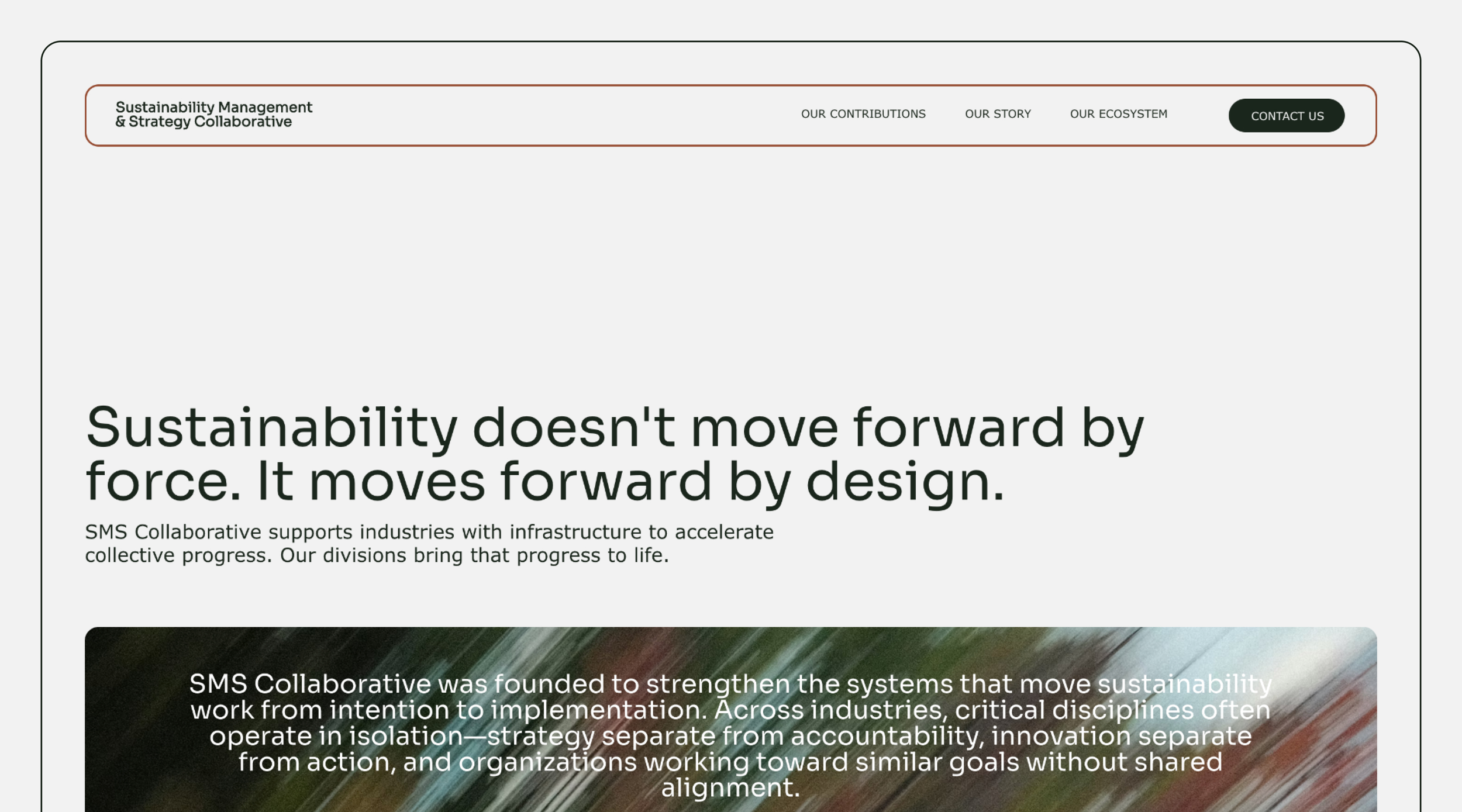
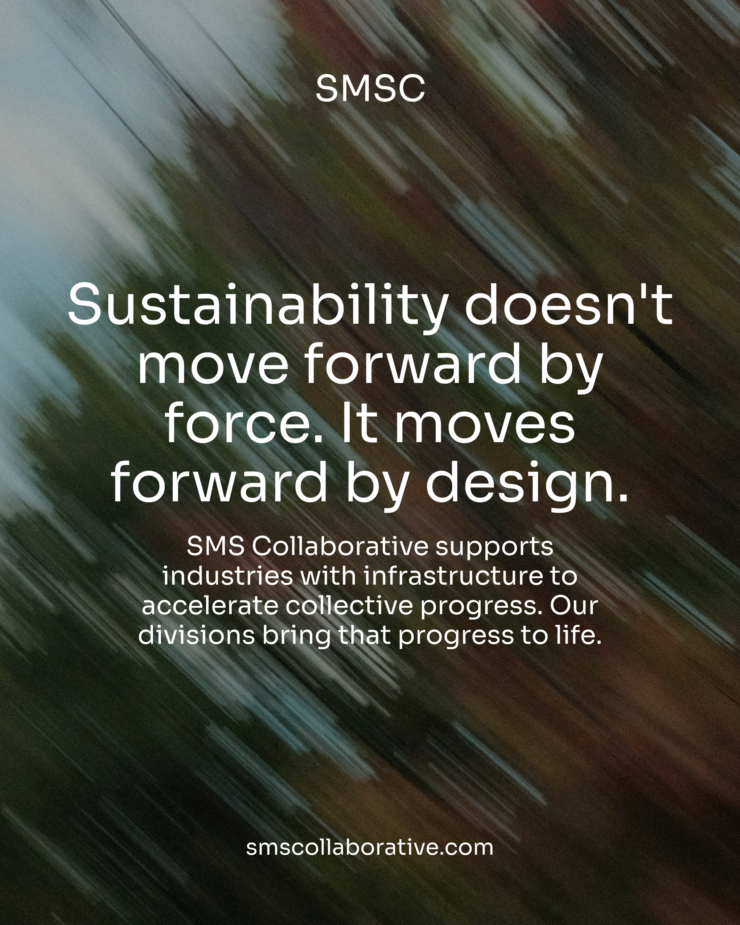
At the core of the system is a belief: Sustainability doesn’t move forward by force. It moves forward by design.
The result is a brand that feels calm, confident, and directional, built to support an evolving ecosystem of partners, platforms, and ideas.
Design as infrastructure.
Clarity as strategy.
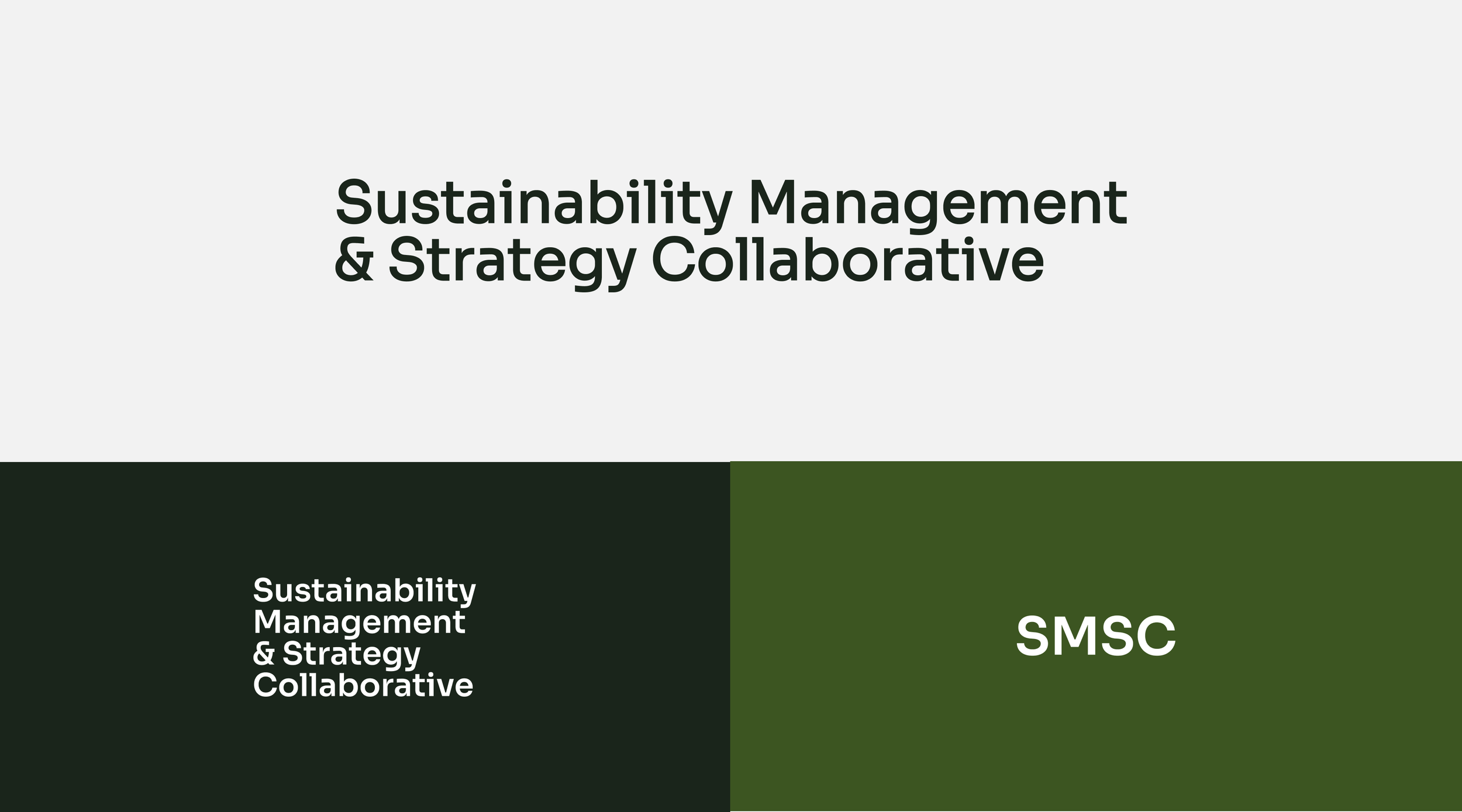
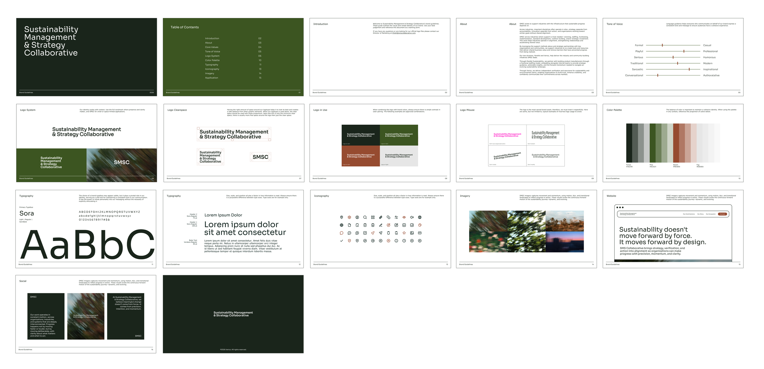
Logo System
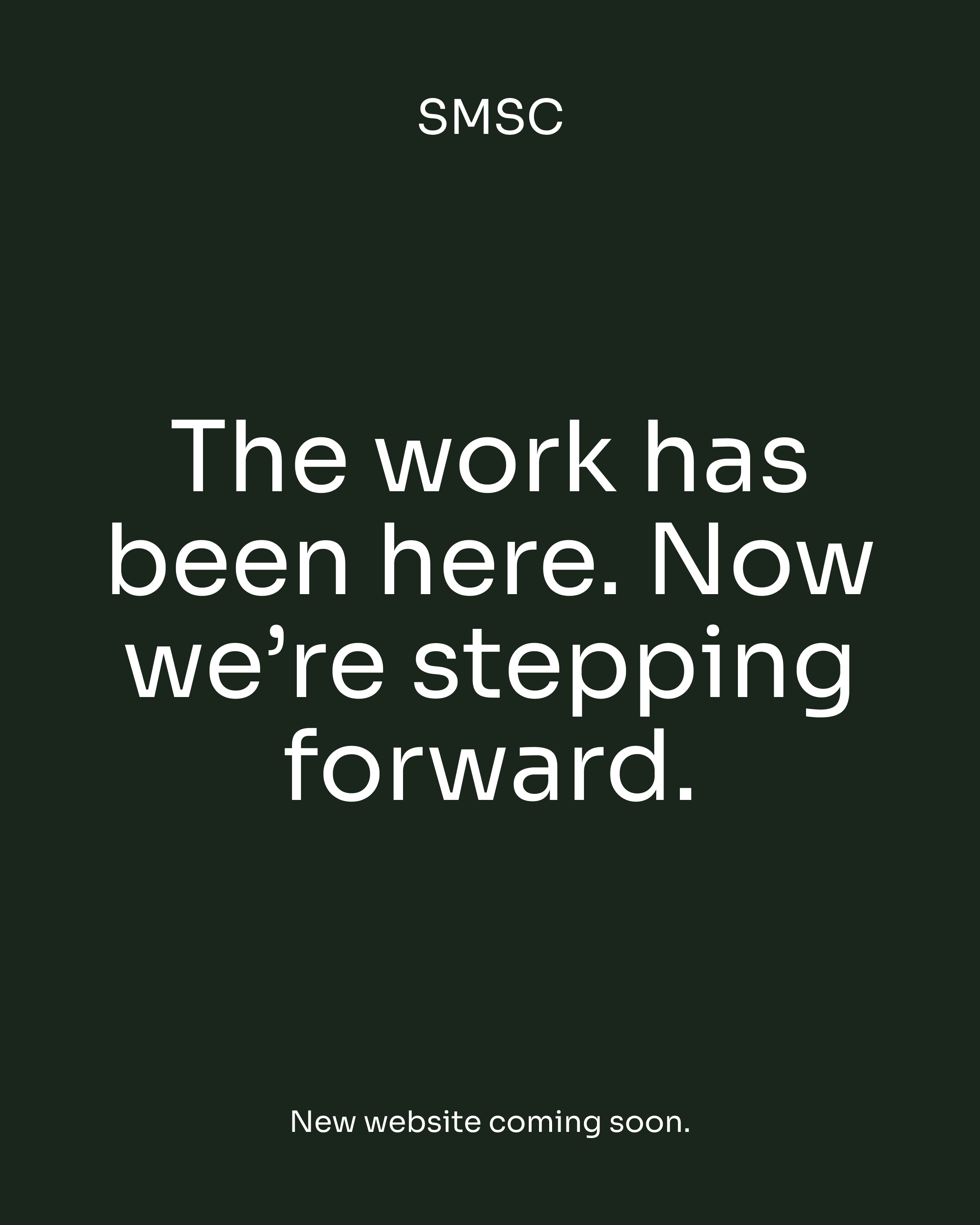
The SMSC identity does not rely on a traditional logo, symbol, or mark to carry meaning. Instead, recognition is built through consistency, typography, and the overall experience of the brand in use. The system is intentionally minimal, allowing clarity and structure to take precedence over visual shorthand. Over time, the brand becomes familiar not because of a single graphic element, but because of how it consistently shows up. The identity is not something you look at, it is something you experience. It is the feeling you get when working with us.
Color Palette
The color palette is grounded in earthy, natural tones that reflect the systems SMSC exists to support. Deep greens, warm neutrals, and muted contrasts create a sense of stability and intention while aligning seamlessly with the broader ecosystem of Parallel and Verico. The palette is designed to feel cohesive across brands without becoming repetitive, reinforcing connection without losing individuality. Every color choice is purposeful, avoiding decoration in favor of clarity and continuity.
Typography
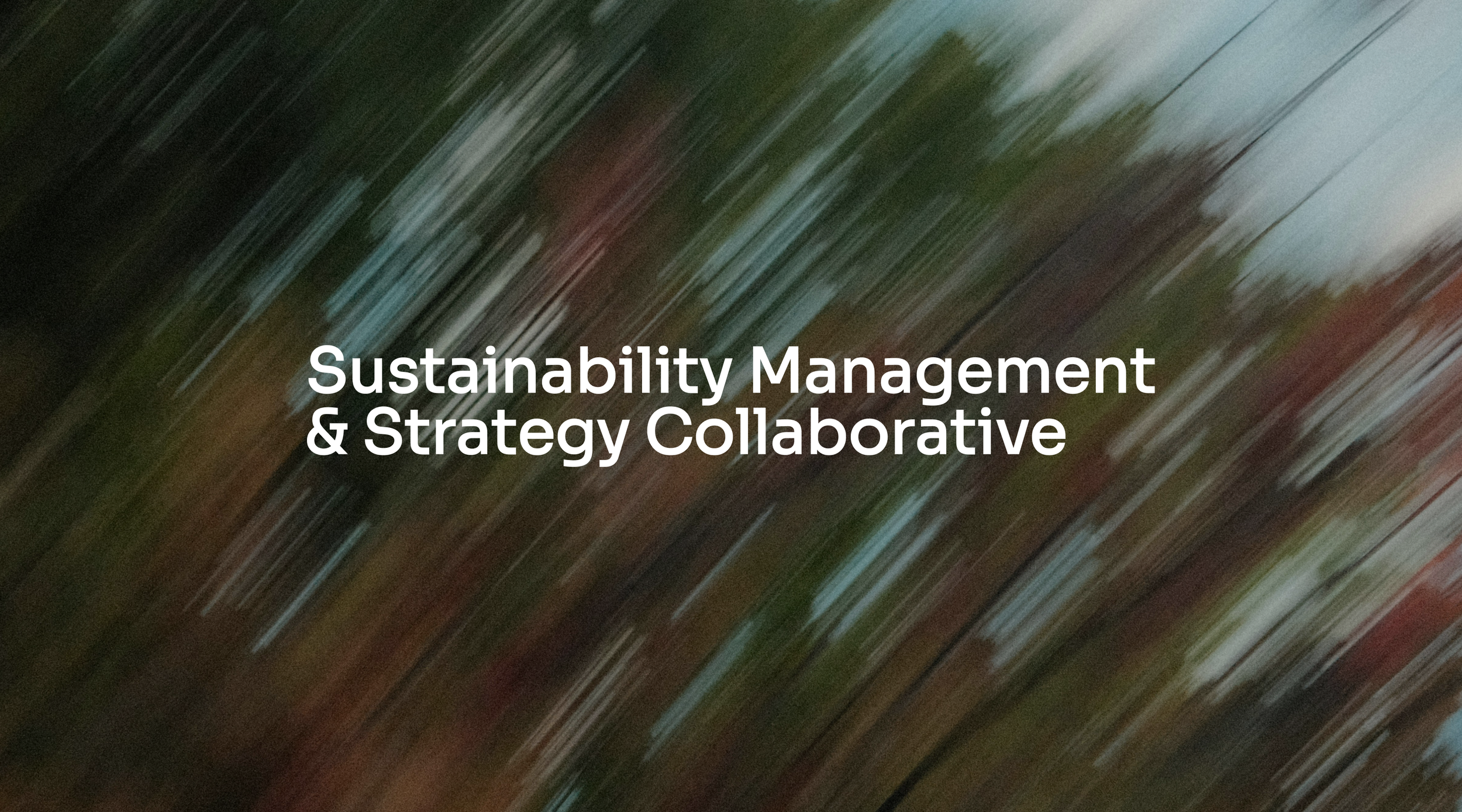
The imagery system draws from nature, but avoids literal representation. Instead of static or overly defined visuals, the approach focuses on movement, light, and abstraction. Soft blurs, shifting textures, and layered compositions create a sense of momentum and adaptability. These visuals are less about capturing a single moment and more about expressing a continuous state of motion. The result reflects how SMSC operates, not through force, but through balance, responsiveness, and sustained forward movement.
Website
The website is designed to prioritize clarity, structure, and ease of understanding. Rather than overwhelming users with information, the experience is paced and intentional, allowing complex ideas to unfold naturally. Generous spacing, clear hierarchy, and restrained interactions create a sense of rhythm that mirrors how SMSC works. Content leads every decision, with design acting as a supporting system that guides users without distraction. The result is a digital experience that feels steady, considered, and easy to navigate.
The rebrand reflects this philosophy through restraint, rhythm, and intentional design, creating a visual language that prioritizes clarity over noise and alignment over urgency.