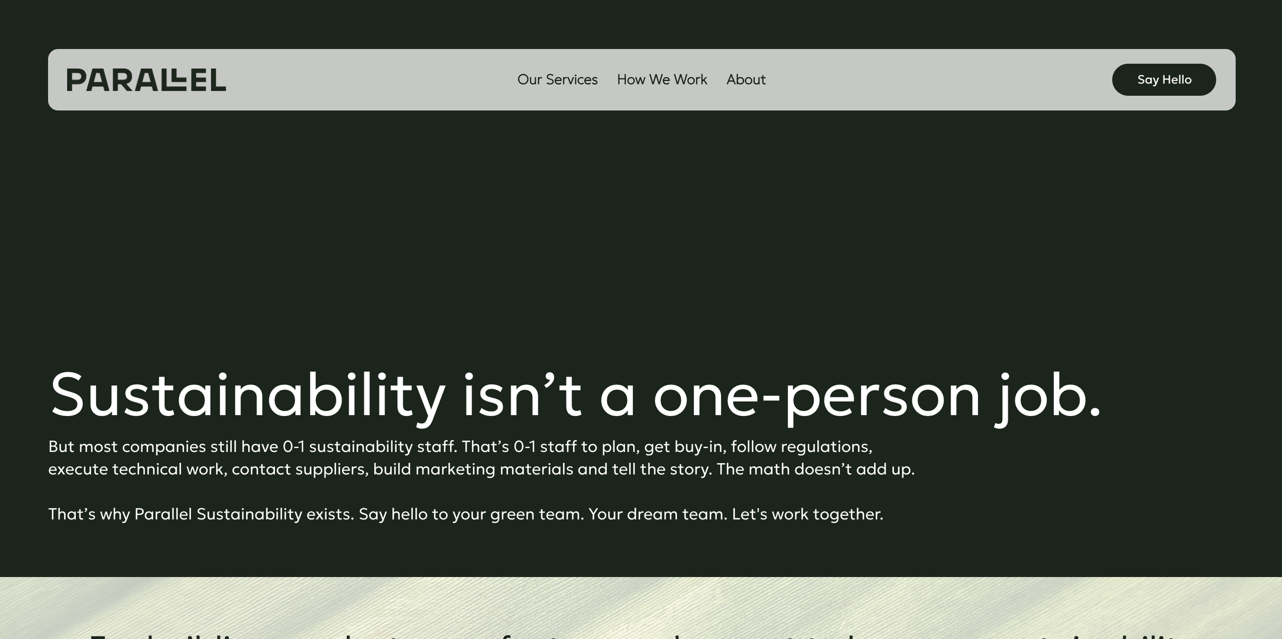
Parallel isn’t just another sustainability consulting firm. It’s a philosophy: progress happens when we work side by side, partnering with clients, collaborators, and changemakers to solve our most complex shared challenges. Parallel delivers business-tailored and industry-wide solutions that accelerate sustainability transformation—not only by advising, but by actually building capacity inside organizations.
My role as Director of Marketing and Creative Strategy was to translate this collaborative, systems-focused approach into a brand that feels strategic, human, and forward-leaning—one that reflects Parallel’s unique operational model and its impact across the built environment.
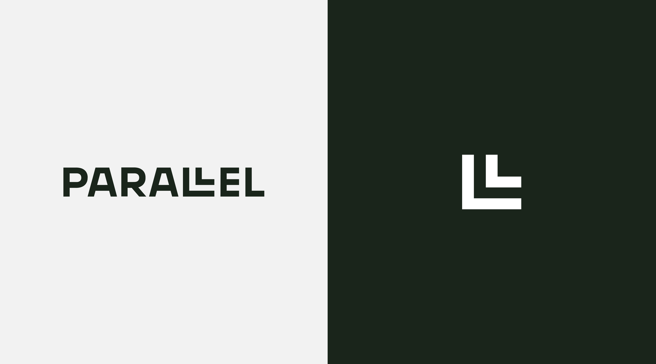
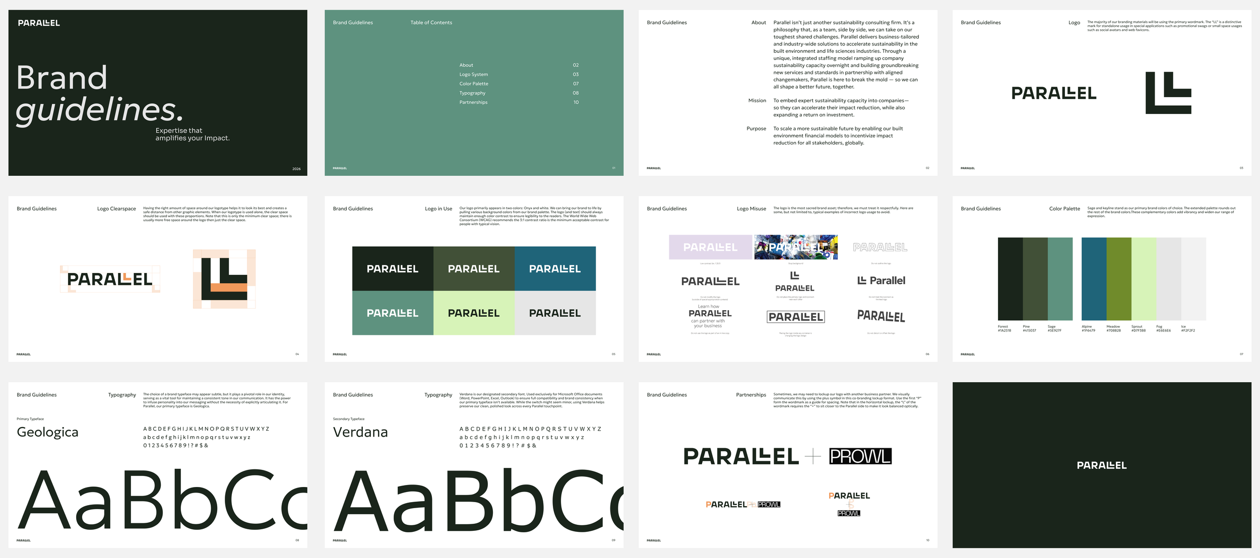
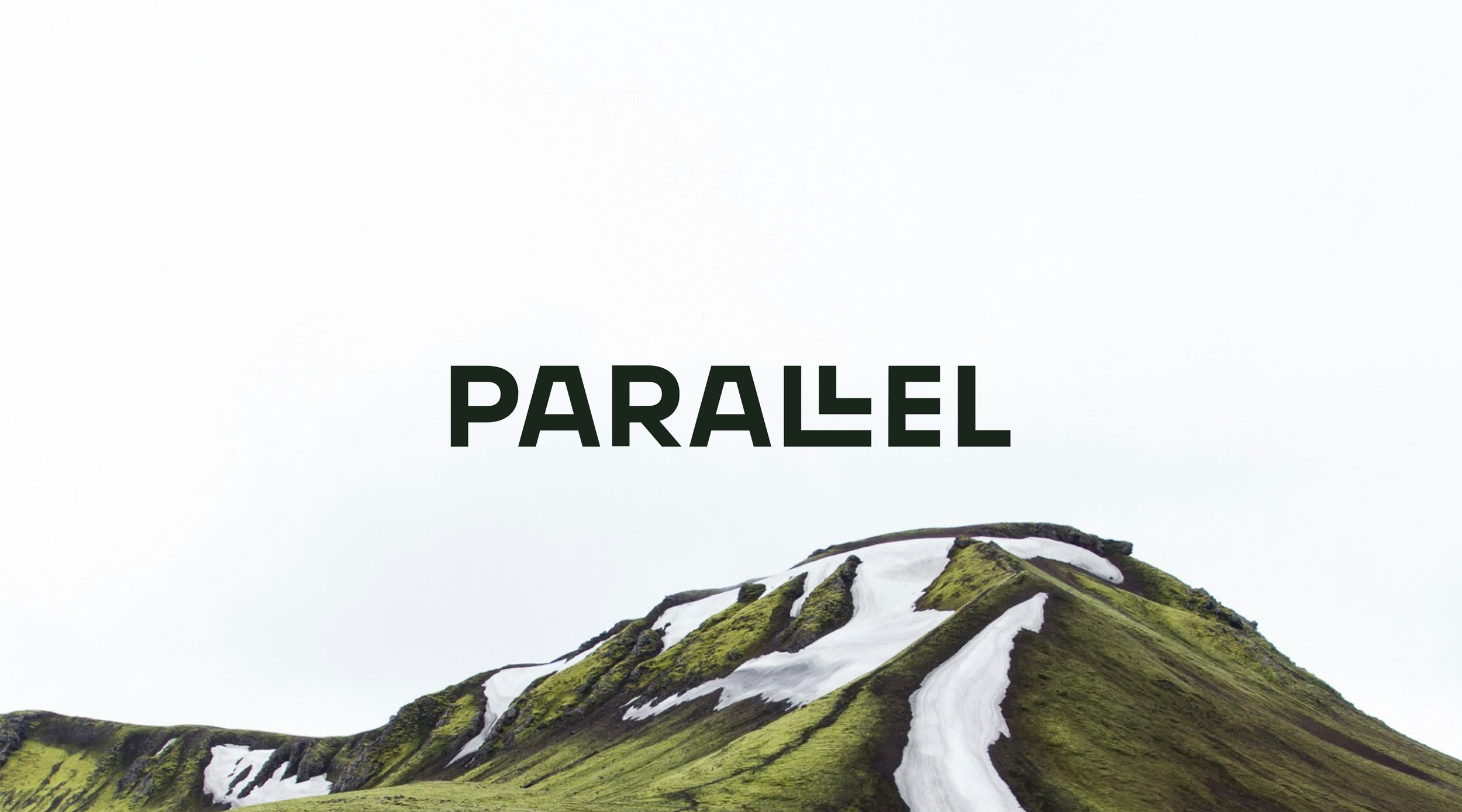
Visual Identity
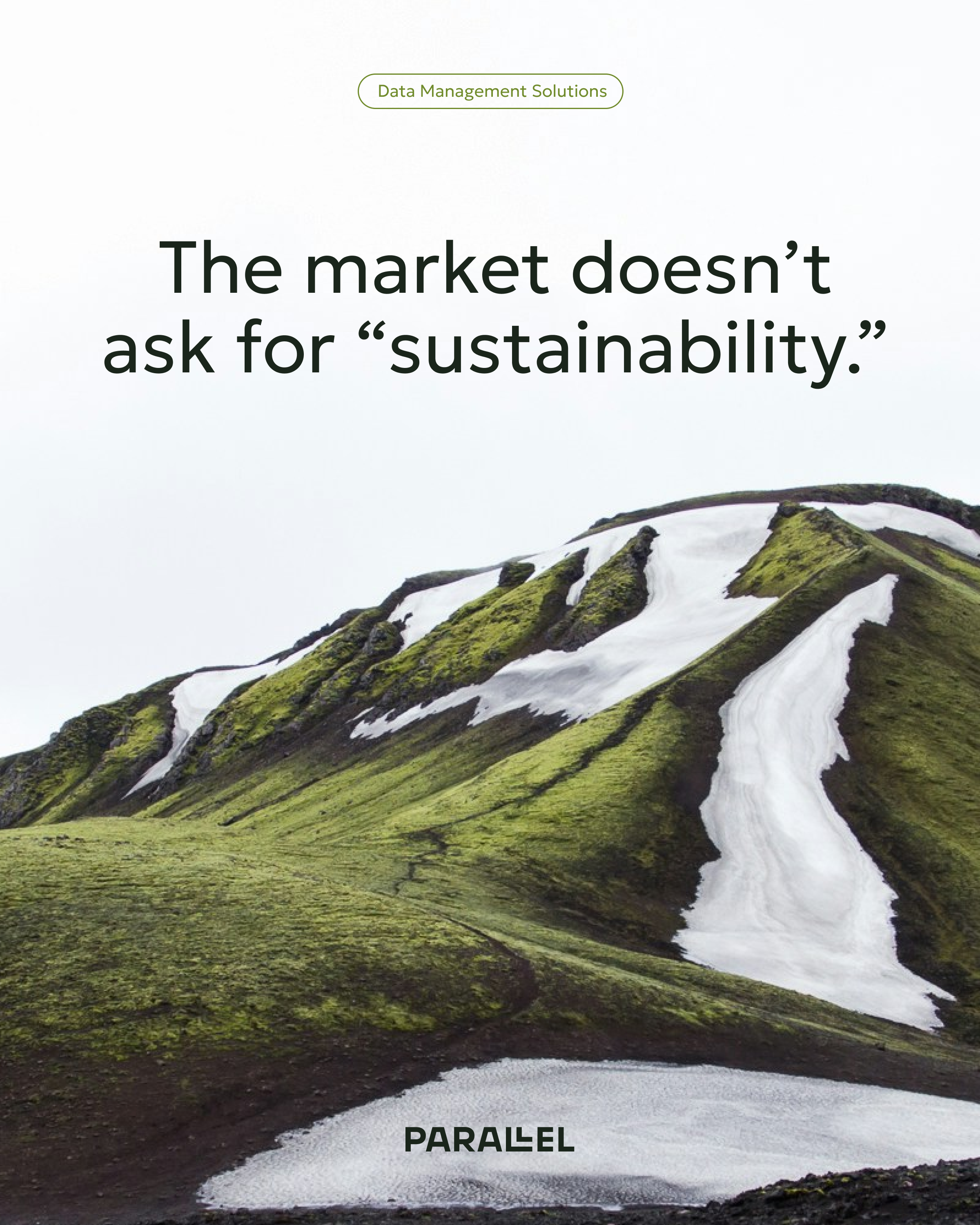
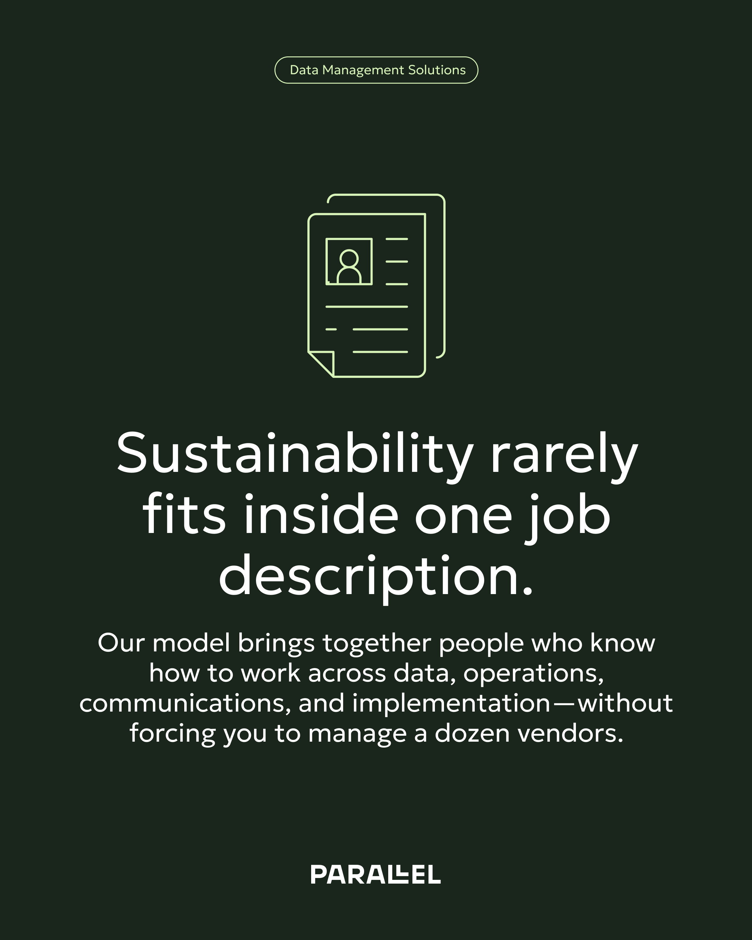
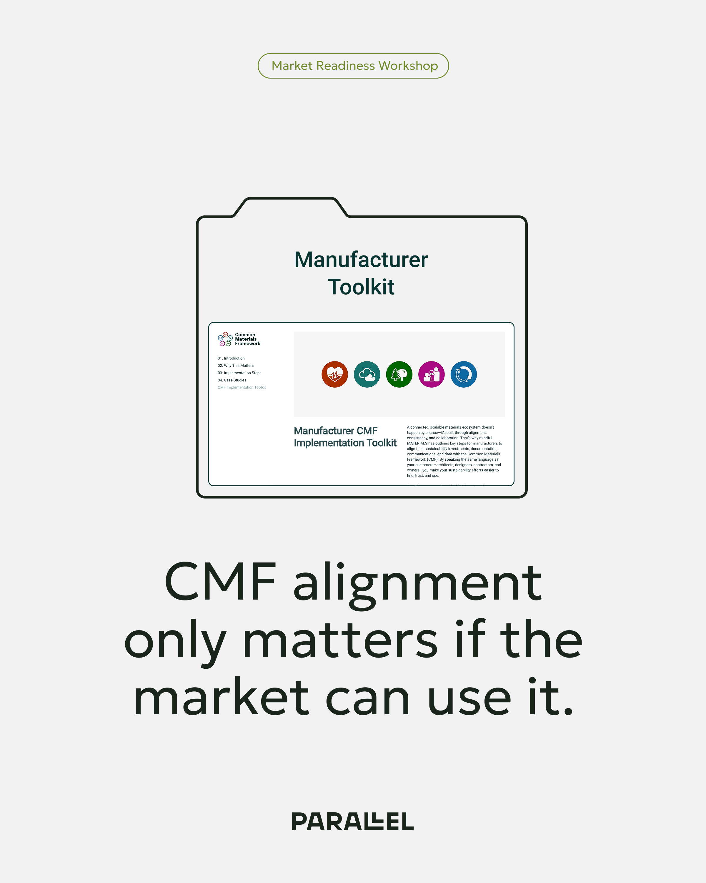
A flexible identity system that suggests parallel motion, alignment, and collective progress without rigid symmetry. Gestural line work, modular spacing, and intentional grid play let the work feel dynamic yet grounded.
Updated Typography
Clean, modern typographic systems were implemented to improve readability and signal confidence without noise. Purposeful use of type scale creates clarity in narrative and reinforces key messages.
Refined Color Palette
A restrained yet bold palette reinforces professionalism while allowing moments of emphasis that draw focus to strategic insights.
Messaging
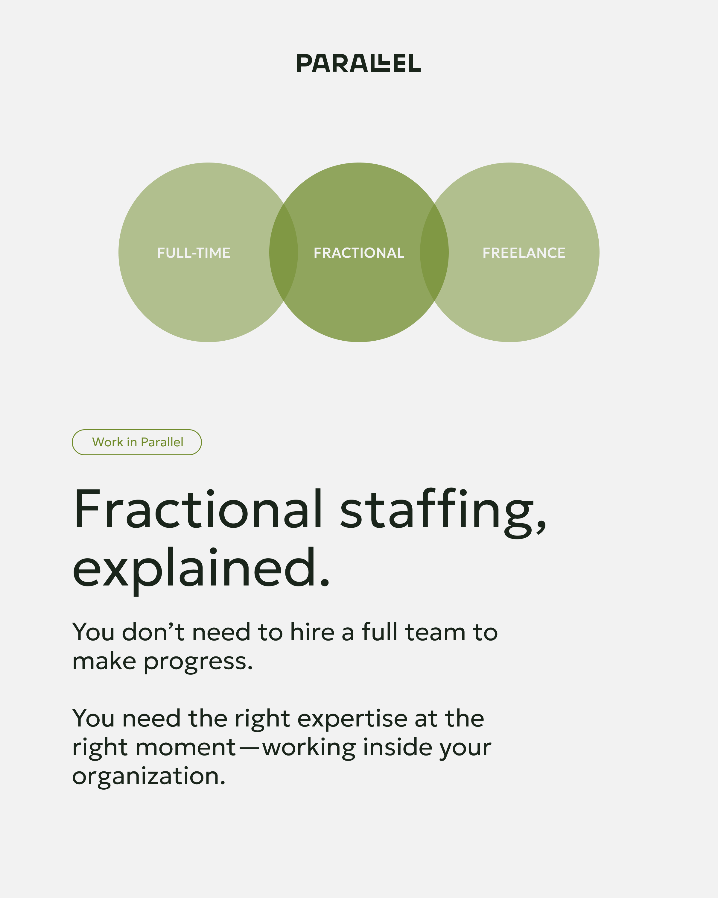
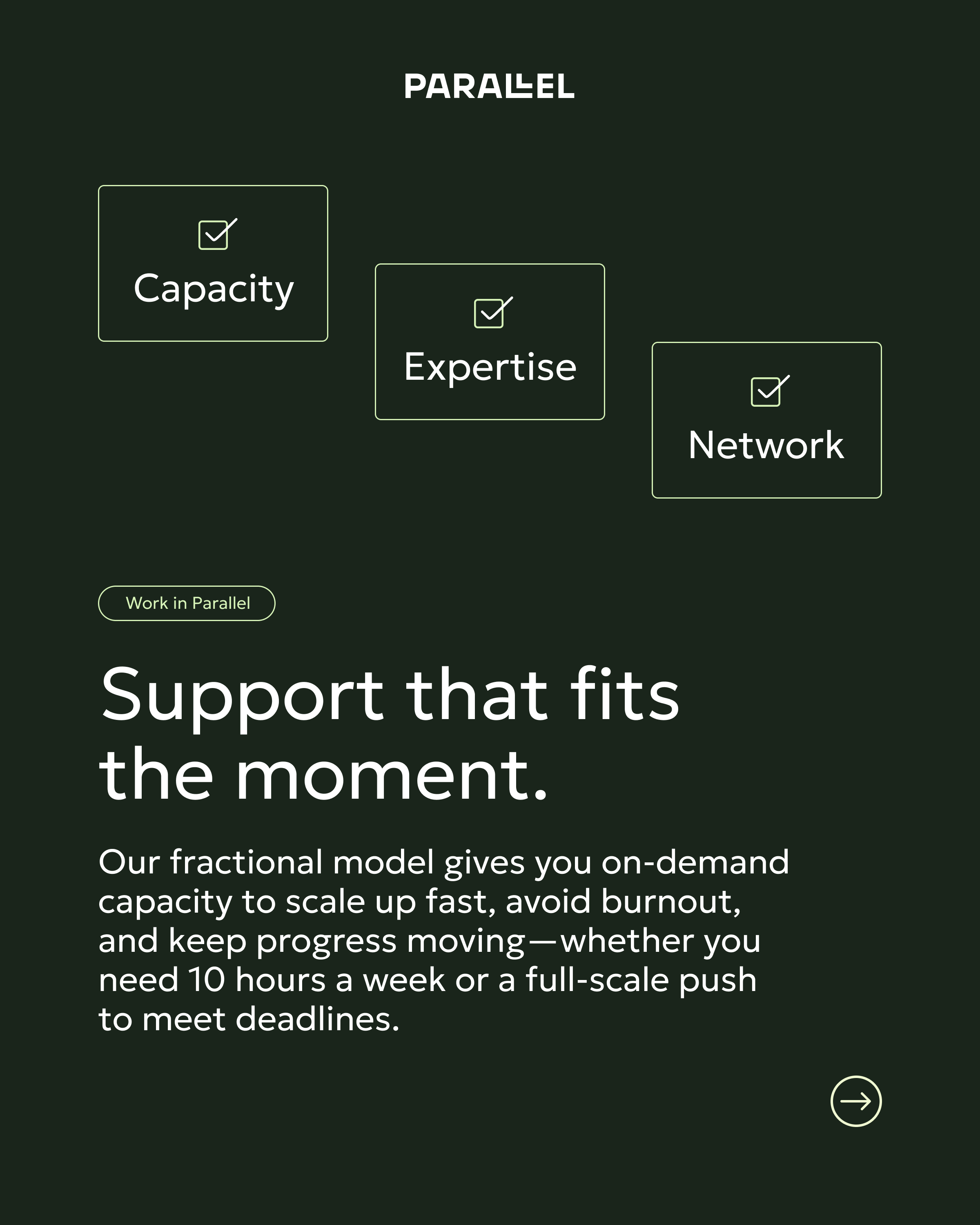
Language that clearly explains Parallel’s embedded sustainability staffing model; concise, direct, human—balancing technical nuance with accessibility.
The final brand system captures Parallel’s core belief that meaningful progress emerges when we move forward in alignment, together. It supports growth into new sectors while maintaining a cohesive visual language that helps stakeholders quickly grasp what makes Parallel different.